Where Should a Link-in-Bio Button Send Visitors?
Choose between a direct action, an offer details page, and a guided flow by finding what visitors still need to decide.
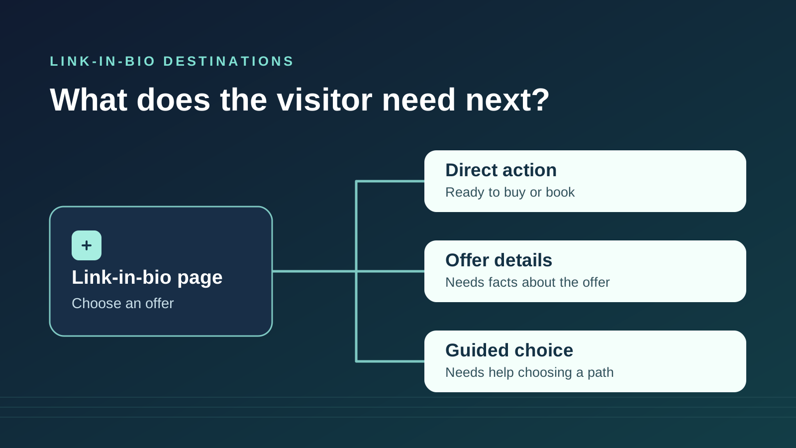
Choose the destination by the decision that remains
The link in a social media profile, such as Instagram or TikTok, often leads to a link-in-bio page with buttons for different offers. Where each button leads matters because the destination determines what visitors can find out before they spend money, choose a date, or share their details.
A direct link works when visitors have enough information to act and the destination confirms what they’re about to do. An offer details page helps when most visitors need the same facts first. A short guided flow helps when the right next step depends on something specific about the visitor. The place to start is the first decision the destination asks them to make.
Find the facts that could change the next step
Open the destination as a first-time visitor and stop at the first request for a decision. That might be choosing a session time, selecting a package, or entering a payment method. List the facts someone would need at that point. For a live class, the time zone can decide whether they can attend. For a paid consultation, the price and what the fee covers can decide whether they want to book.
Put facts before the first decision they could change. A class prerequisite belongs before class selection because it determines which class someone can take. Refund terms belong before payment and may need to appear earlier if visitors are choosing between a refundable ticket and a cheaper fixed booking. Information needed only to complete a later step can sit with that step.
Check what the destination actually shows before commitment. A booking page with the session length, price, and cancellation terms above the calendar may already do the work of an offer details page. If the price appears only after someone enters contact details, they need an earlier way to see it.
GOV.UK guidance on connecting information and transactionsOpens in a new tabUse the shortest path that answers the question
Send people directly to the action when the offer is specific and the destination lets them confirm the important terms before committing. This works especially well for a repeat purchase or a named event with a checkout that shows the date and total. A direct link saves a page visit. It also puts more responsibility on the destination to supply enough context for someone arriving from an older post or from the profile alone.
Send people to offer details when the same information applies to almost everyone and the action page gives it too late. Put the decisive facts near the action on that page so people can check them and continue in one place. An extra page costs time if it repeats the profile and makes people hunt for the real button. It earns that time when it answers a question people would otherwise have to leave the transaction to resolve.
Use a guided flow when an answer changes the recommended destination and visitors may struggle to make that choice from a list. Write out the decision before building the questions. For each answer, name where it sends someone and why. If two answers lead to the same destination for the same reason, combine them or remove the question. If a simple fact lets visitors choose for themselves, show the fact with the offer.
Example: Three paths for a pottery studio
Suppose a pottery studio uses its link-in-bio page to sell gift cards, book workshops, and recommend studio memberships. A button labeled “Buy a studio gift card” can go straight to the purchase page if it shows the available amounts, delivery method, and where the card can be redeemed before payment.
For an introductory wheel workshop, the calendar asks for a date and contact details before revealing the price and whether firing is included. “See wheel workshop dates and prices” can open a details page with those facts and a clear booking link. If the studio later puts those facts on the calendar before date selection, it can send visitors straight there and maintain one fewer page.
Membership is a different decision. The studio offers independent practice to people who have already completed an orientation and an orientation session to newcomers. A “Find your studio membership path” button can open a question about orientation. Someone who has completed it sees the membership details. A newcomer sees how to book orientation. Someone who is unsure gets help identifying what counts. If the studio can explain the distinction in one line and both destinations are easy to identify, two named links may be faster.
Watch where visitors lose the information they need
Test the path on a phone from the profile. Give someone a realistic goal without saying which button to tap. Let them choose a button and look for the offer without coaching. Afterward, ask what they expected to see, what they learned at the destination, and what they still needed to look up. Note the first point where they hesitated or backtracked. Let them stop before any real payment, booking, or submission.
If someone chooses the wrong button, check whether the labels distinguish the jobs people came to do. If they choose correctly and immediately go back to find a price or prerequisite, move that fact earlier. If they can explain the offer and decide it is out of budget or unsuitable, the destination helped them make an informed choice. If they start a guided flow and cannot see why an answer matters, check whether that answer changes the outcome. Explain its purpose or remove the question.
Use counts of completed actions alongside these observations when the destination gives you reliable counts. More button taps alone can reflect curiosity or confusion. If you compare two periods, check whether the offer, availability, or mix of posts sending visitors changed. A small set of task tests can show you where a path breaks. Use it to choose the next change and retest that step.
GOV.UK guidance on observing and measuring task successOpens in a new tabGive one button a clearer destination
Pick one button and write down what a visitor should know before the first decision it leads to. Open the destination on a phone and see which of those facts appear in time. Keep the direct route if the facts are there. Move the details earlier if everyone needs them. Add a guided question only if the answer changes the route.
In QuizFlow Labs, you can use a Button block in the Bio Funnel builder and set its action to Redirect URL to send visitors to a specific offer page, booking page, or checkout. Set the destination and button label together, then walk through the path from the profile through the first decision.
Explore the Bio Funnel builder guideQuizFlow Labs
Build a link-in-bio page that guides visitors to their next step
Give each offer a clear destination and use guided questions where the answers change the route.
Start building with QuizFlow Labs